For our last assignment/lesson, we were going to design, cut, and print our own Block Print. We were able to use tracing papers to make the design, and find inspirations online. My original idea was what I normally do, the ocean. I was going to do two seahorses. But then I came across a picture of the moon. It really inspired me. So, I traced the main outline, then added my own touches. I then added a star in the sky which was shining brightly, and then also added a tiny sun being held by the moon. Here are pictures to show the printing process:
Art 135 Blog Space
Thursday, 13 December 2012
Maskventures
I have loved working with clay since I took classes in North Carolina a few years ago. For this assignment we were to make a mask. The first step was to research and draw 5 design ideas. Out of those ideas the one I chose to use for inspiration for my mask was the Sugar Skull which was made in Mexico. I wanted to use the skull idea, but add my own details which would be more of a hint of my interests. I have always been around the ocean, and then I moved here to Saipan, which is surrounded by ocean. So, my mask would represent that love I have for both my Home in NC and here in Saipan.
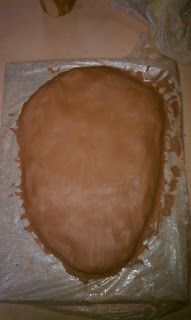
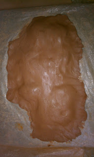 First we began by building a base. We rolled clay into balls and used them to build up the thickness of what would begin to form into my mask. Here are pictures showing the beginning...
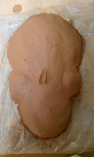 Once i had a base, I was able to begin subtracting clay and shaping it to form the right shape of the sugar skull.
Then I kept shaping till I was able to put more details in, like teeth, and add in the shells, starfish, and barnacle.
Once the mask was shaped, I decided to begin painting. For this project, I wanted to go with the flow, in other words, decide on color as I went. I used blue for the starfish, which is popular here in Saipan. I chose to use a fabric plumeria I bought the first month I moved to Saipan. I painted it to look like the plumeria from my new house.
The final addition I added was add sand to the right eye socket and the nose. I felt that this gave my mask the finishing touch it really needed.
The process:
Wednesday, 7 November 2012
Sunday, 14 October 2012
Gesture Drawing
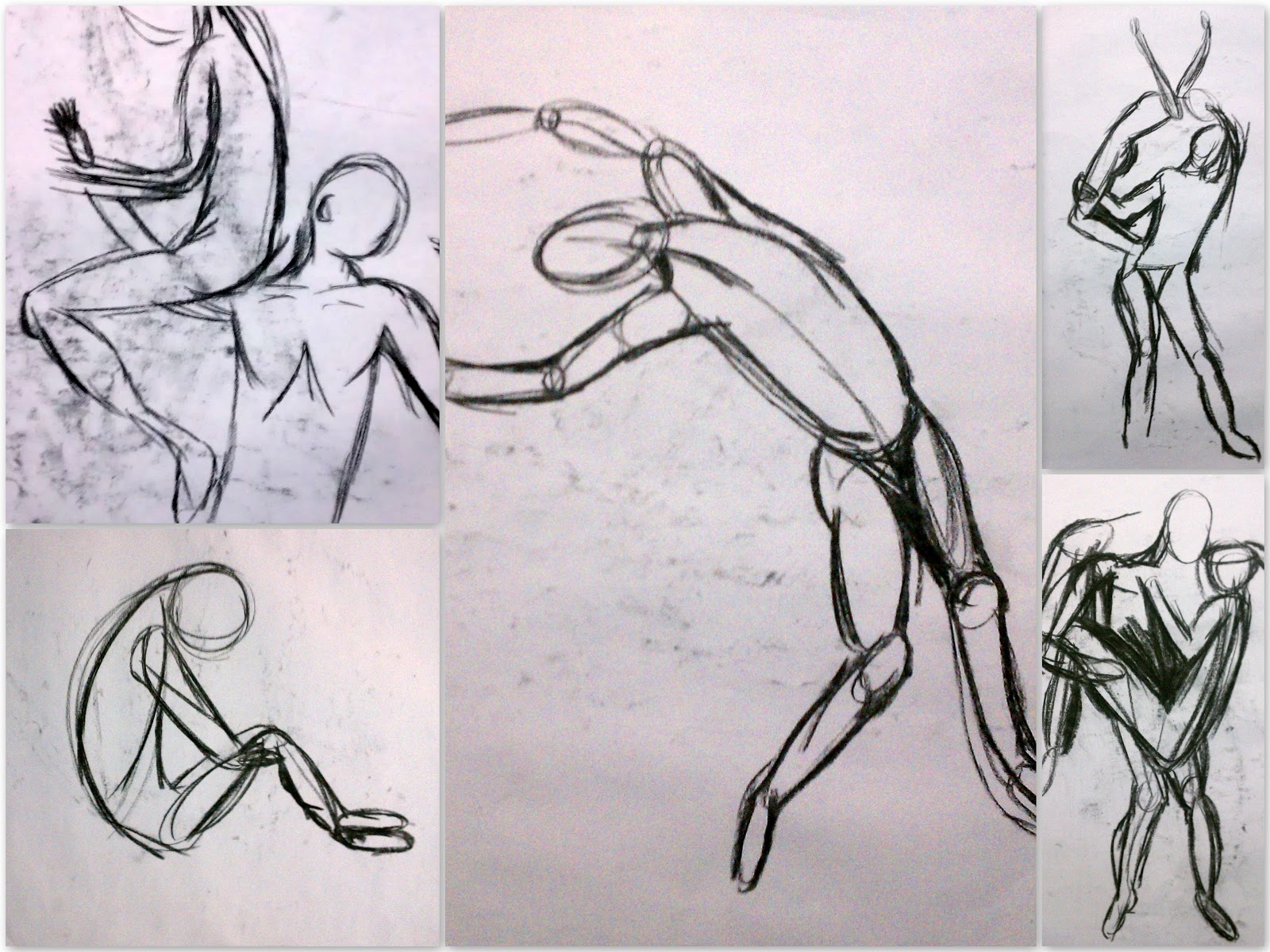 During this assignment, we were to take the defined lines and drawings which we had been doing and loosen up. During the gesture drawings, we began with drawing a general line to the form of the body or figure. Then in using bubbles and circles we could begin to see the form take shape, and movement. As we progressed, we could begin cutting out the line and the bubbles and just focus on using "wire" lines in the drawing. The lines were to give movement to the subject on the paper. This simple lesson has made me more confident in drawing figures now. Using this gesture drawing technique, it is easier to see the form of a figure.
Neutral Ground Figures
Once I began this assignment, I actually became more comfortable then I was in the last Light Value drawing we did. I began to understand better how using the eraser, you slowly begin to "paint away" the darkness to form the subject which we were to "draw." Once I was able to do the subjects I was able to go in and with my pencil add crosshatching and to darken the negative spaces and in the contour of the bodies. Also the use of the white chalk helped me to define the bodies a bit more. My work shows a big difference in values, from white to dark black.
Neutral Still life
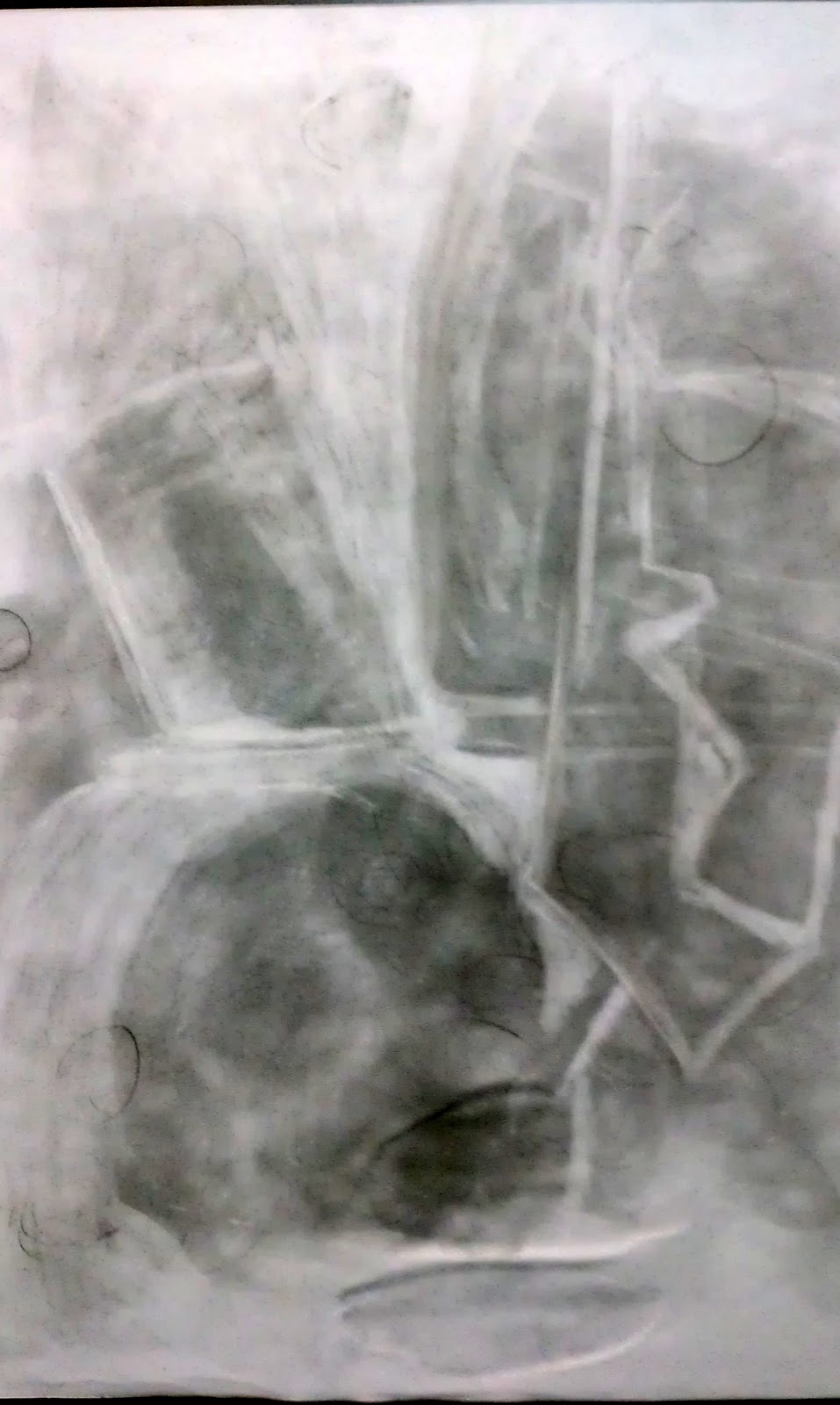 During this assignment I found that wrapping my mind around the concept was difficult for me. We were to use a middle value ground and in using our eraser, draw out what we saw in the still life. The concept behind this lesson was learning how to take a neutral space and change the value to form works of art. We were able to practice value differentiation and how to change the value in certain areas. The eraser would make the shade lighter while the use of our pencil could make the negative space and shadows darker. I did not really grasp the idea till we got to our second assignment which is very close to this one. What I did like was learning how to take a darker background and using it to draw in lighter objects. Also, using the chalk allows you to add extra contour to the drawing itself and to help with the shape of the objects against the light source.
Interior Contour
In art, there are three types of lines which may be used. There is Actual lines which are as they seem, are present in the drawing. An actual line may be curvy or straight, thick or thin. Implied lines are usually formed or represented with dots or dashes (- - - - / . . . . . . . . . ). Even though the dots or dashes may not touch, they "imply" there there should be a line there. And the third line is one used every day, is the psychic line. When we are looking at anything there is a psychic line connected from our eyes and what we are looking at. When we want to show someone something, we may point at the object, which is another form of a psychic line.
My drawing consists mostly of thick and thin actual lines. There are some places where the lines are not continuous so they could be considered an implied line. When I wanted to make an area of the drawing flow differently the lines would go in a different direction. When I wanted an area to be darker in value, I would use heavy lines or more lines. I used some crosshatching for darker shadow areas, and tried to stay with the actual original flow of the lines which were cast upon the still life in class.
Subscribe to:
Comments (Atom)


