For our last assignment/lesson, we were going to design, cut, and print our own Block Print. We were able to use tracing papers to make the design, and find inspirations online. My original idea was what I normally do, the ocean. I was going to do two seahorses. But then I came across a picture of the moon. It really inspired me. So, I traced the main outline, then added my own touches. I then added a star in the sky which was shining brightly, and then also added a tiny sun being held by the moon. Here are pictures to show the printing process:
Thursday, 13 December 2012
Maskventures
I have loved working with clay since I took classes in North Carolina a few years ago. For this assignment we were to make a mask. The first step was to research and draw 5 design ideas. Out of those ideas the one I chose to use for inspiration for my mask was the Sugar Skull which was made in Mexico. I wanted to use the skull idea, but add my own details which would be more of a hint of my interests. I have always been around the ocean, and then I moved here to Saipan, which is surrounded by ocean. So, my mask would represent that love I have for both my Home in NC and here in Saipan.
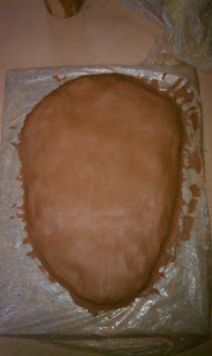
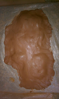 First we began by building a base. We rolled clay into balls and used them to build up the thickness of what would begin to form into my mask. Here are pictures showing the beginning...
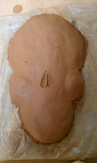 Once i had a base, I was able to begin subtracting clay and shaping it to form the right shape of the sugar skull.
Then I kept shaping till I was able to put more details in, like teeth, and add in the shells, starfish, and barnacle.
Once the mask was shaped, I decided to begin painting. For this project, I wanted to go with the flow, in other words, decide on color as I went. I used blue for the starfish, which is popular here in Saipan. I chose to use a fabric plumeria I bought the first month I moved to Saipan. I painted it to look like the plumeria from my new house.
The final addition I added was add sand to the right eye socket and the nose. I felt that this gave my mask the finishing touch it really needed.
The process:
Wednesday, 7 November 2012
Sunday, 14 October 2012
Gesture Drawing
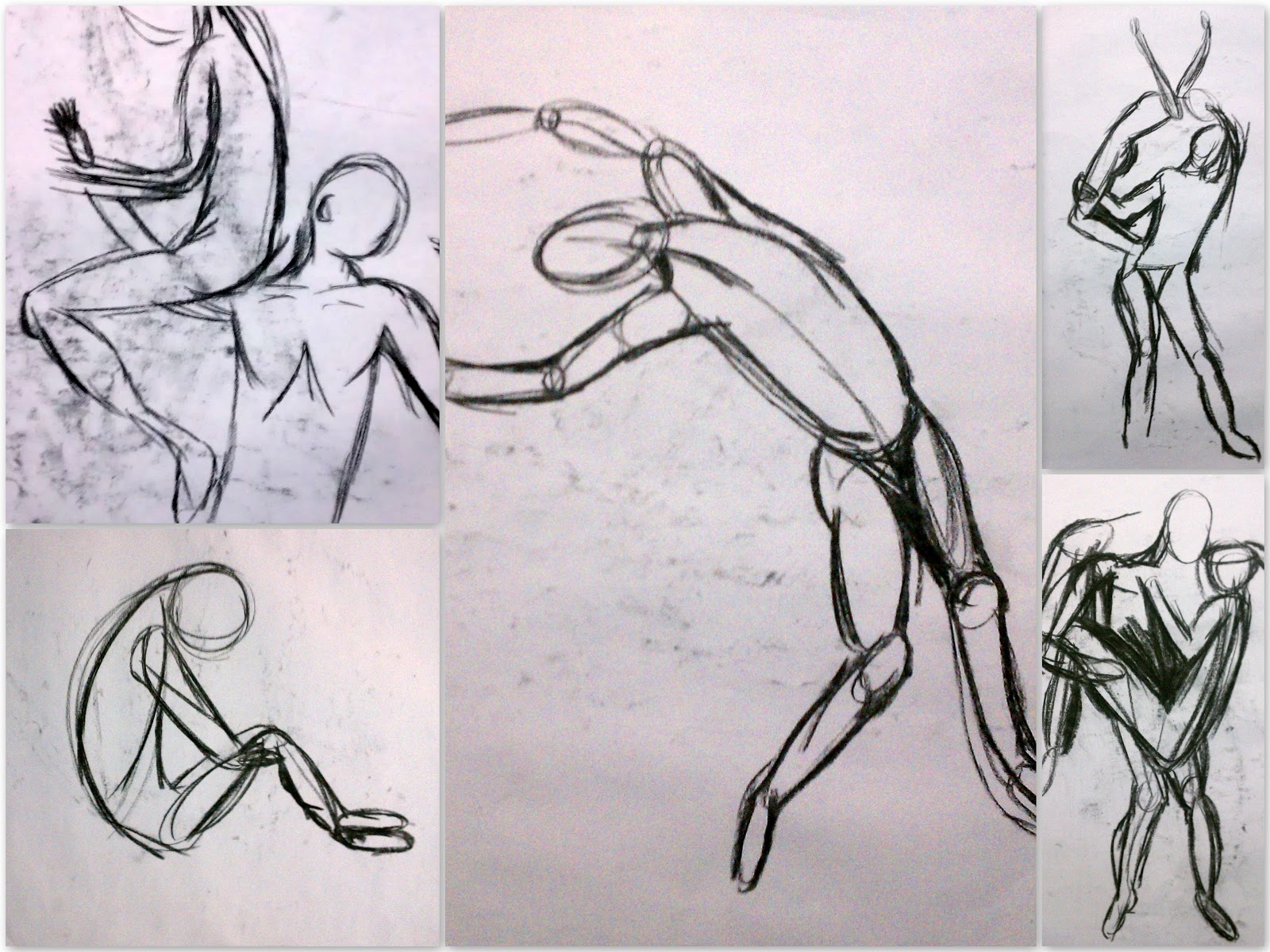 During this assignment, we were to take the defined lines and drawings which we had been doing and loosen up. During the gesture drawings, we began with drawing a general line to the form of the body or figure. Then in using bubbles and circles we could begin to see the form take shape, and movement. As we progressed, we could begin cutting out the line and the bubbles and just focus on using "wire" lines in the drawing. The lines were to give movement to the subject on the paper. This simple lesson has made me more confident in drawing figures now. Using this gesture drawing technique, it is easier to see the form of a figure.
Neutral Ground Figures
Once I began this assignment, I actually became more comfortable then I was in the last Light Value drawing we did. I began to understand better how using the eraser, you slowly begin to "paint away" the darkness to form the subject which we were to "draw." Once I was able to do the subjects I was able to go in and with my pencil add crosshatching and to darken the negative spaces and in the contour of the bodies. Also the use of the white chalk helped me to define the bodies a bit more. My work shows a big difference in values, from white to dark black.
Neutral Still life
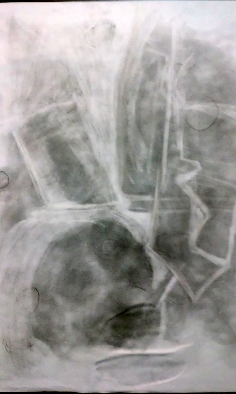 During this assignment I found that wrapping my mind around the concept was difficult for me. We were to use a middle value ground and in using our eraser, draw out what we saw in the still life. The concept behind this lesson was learning how to take a neutral space and change the value to form works of art. We were able to practice value differentiation and how to change the value in certain areas. The eraser would make the shade lighter while the use of our pencil could make the negative space and shadows darker. I did not really grasp the idea till we got to our second assignment which is very close to this one. What I did like was learning how to take a darker background and using it to draw in lighter objects. Also, using the chalk allows you to add extra contour to the drawing itself and to help with the shape of the objects against the light source.
Interior Contour
In art, there are three types of lines which may be used. There is Actual lines which are as they seem, are present in the drawing. An actual line may be curvy or straight, thick or thin. Implied lines are usually formed or represented with dots or dashes (- - - - / . . . . . . . . . ). Even though the dots or dashes may not touch, they "imply" there there should be a line there. And the third line is one used every day, is the psychic line. When we are looking at anything there is a psychic line connected from our eyes and what we are looking at. When we want to show someone something, we may point at the object, which is another form of a psychic line.
My drawing consists mostly of thick and thin actual lines. There are some places where the lines are not continuous so they could be considered an implied line. When I wanted to make an area of the drawing flow differently the lines would go in a different direction. When I wanted an area to be darker in value, I would use heavy lines or more lines. I used some crosshatching for darker shadow areas, and tried to stay with the actual original flow of the lines which were cast upon the still life in class.
Sunday, 7 October 2012
Abraham Lincoln in Chalk
I was rather intimidated by this assignment. To begin with I
was absent the day the assignment was explained, and the whole idea of using
the chalk freely was definitely going to be a different turn for me. I must say
my worries were way wrong. As soon as I began rubbing the white chalk against
the black paper, I automatically began to form out the drawing section by
section. As I was drawing, I would look at the picture, and try to imagine his
face. Imagine the contour and shadowing which happens when you work with the
relationship between the chalk and paper. . In order to show the value
difference in this piece, all you had to work with was the lightness of the
chalk and the darkness of the black paper background. By rubbing the chalk hard
or more often on a place, the value keeps getting lighter and lighter. By using the blunt end of the chalk only, I
was able to complete a work which showed lines, values, shadows, and details.
Sunday, 30 September 2012
Seated Boy
This was a drawing in which I struggled with in the
beginning. We were to look at a drawing and using contour lines, draw the
outline of the figure. Once that was complete, we were to use crosshatching to
give value and contour to the figure. We were supposed to not see the contour
line drawn in the beginning but you can still see mine some. Transitioning was
the hardest part for me. From contour to crosshatch and dark to light. But I
began to get a better idea of what to do after working on the assignment for a
few days. When you want an area to be darker, your lines need to be closer
together and more of them. The main idea of this assignment was to have us
learn to use crosshatching easily ad correctly. Now, I feel like I would be
able to do another drawing such as this on my own, and one day be able to do a
complete drawing only using crosshatching.
Texture
.

I came across a vintage ad online which showed an African American woman pointing at a younger African American girl. Both had these big, beautiful, afro's and it was something that really caught my eye. As soon as I saw the picture I saw where and how I could use texture to give the contour line drawing more of a story.
I knew that I wanted to use 4 different textures in this drawing. I needed a texture for: the hair, skin, earrings, and background. For the hair I used our wooden door. It gives it a look as if there is space in between the hair itself, and really seemed to resemble closely to what hair might look like. For the skin I wanted something practical, so I went with the cement walls. This gave a small bit of texture, yet was not out of place. For the earrings, though small, I used tile on my floor which look almost like leopard print. And then, the last texture I wanted to add was the background. I used the tile in my kitchen, and it began to take shape almost like a fence or maybe wallpaper. I just felt like it worked great. All the textures together seemed to paint a picture better than just the contour line drawing.
Model for Critique of Haring drawing
For this assignment, I am going to critique my own Keith Haring inspired drawing which we did in week one of class. The model for critique goes as follows: Description, Analysis, Interpretation. In Description you give a verbal account of what you see in the drawing. Color, shapes, etc. In Analysis you discuss how things are presented. Value, Scale, etc. In Interpretation you discuss what you think the meaning or effect of the piece is. So I will write a step by step critique of my own drawing.
Description: I see the colors red, gold, grey, green. I see two figures and a round globe like object. I also see smaller objects which are piled on top of the larger round object.
Analysis: I see that the round object is earth, and the scale of the earth is not equal to the scale of the figures in the drawing. I can see that there is movement in the small objects and in the figure under what seems to be earth. The colors are bright and seem to have meaning.
Interpretation: Since I did this myself, it is easy to interpret. There are two figures which seem to have meaning. One figure is holding the earth on its back while on its hands and knees. This figure has a green recycle "heart" which says to me that the person is someone who cares for the earth which is perched on their back. Then you have what looks like a pile of trash which is on top the earth, weighing it down upon the figure. The trash is being thrown there by a figure who shows no head, who is standing up on a golden color stool. This figure must represent a large number of people, not just one person. It seems that what the whole drawing is saying is there are people who litter and thrown their trash on the ground, almost as if they are too good or too lazy to throw their rash away correctly. So, then you have the people who are always "walking behind" these people to help keep the earth and environment clean and healthy.
Negative Space & Still Life
During this classroom assignment, we were to draw the negative space of a still life put in front of us. The purpose was to be able to see things in life, all around us, and be able to see the negative space as well as the positive.
Using contour lines, we were only supposed to draw the negative shapes, and not the positive details in the still life itself. Once we accomplished that, we then were to experiment using lines in the negative space. In doing this, you can still see what the still life was in a way, even though there were no added details to the positive space.
What I decided to focus on in the still life was the frame, the stool, the lamp cord, the large and small pottery. When you look at my drawing, you can see the negative outline of them easily once you know what was included in the still life. The negative space is filled with crosshatching and fluid like lines. I wanted to show two values, dark and light in the negative space.
Sunday, 9 September 2012
Positive/Negative Bird
I have really never thought about nor been introduced to
the concept of Positive and Negative space. I tend to be a believer in Quantum
Physics and am always wondering if the things around me are really what I perceive
them to be. So, I must say that this lesson was very interesting for me and
even in a way flows along the same path as Quantum Mechanics.
We were asked to look at a picture up on the screen. “What
do you see?” we were asked. Well, I saw two black objects which seemed very
flat and were just randomly put there. But, ah hah! Lines were then given to
the “empty” space, which sat white and alone, and now we are looking at 3
dimensional objects! Boxes to be exact! Simply adding the connecting lines gave
these inadequate objects meaning to the mind now! But, had the objects been
there the whole time? Why had I not been able to see them? Answer is, each side
of our brains is fighting against each other. Logic, creative, logic, creative.
Also, we are so used to only focusing in on the obvious objects around us (Positive
space) that we forget to even see the “empty” space (Negative space).
So, for the assignment, we were to look at a simple
drawing of a bird and a circle, and draw only the Negative space around it. By
using simple couture lines and a grid drawn on my paper, I was able to draw out
the negative space I saw in the picture. It was a rather simple drawing, but,
again we needed to focus on the scale of the picture, and then sizing it to our
paper which was much smaller than the original picture. Once we finished the
drawing, we were to finish the age by only drawing in the negative spaces. Using
a HB pencil, I wanted to do some experimenting with lines, pattern, and value.
 There are really three different areas in my drawing. The
first area consists of the tree, which seems to be hugging the moon. It is
swirly and very whimsical. I used short line marks to shade in the sky around
the tree and moon. Then, using my fingers, I smudged it up a bit just to make
it feel softer.
Below it, the bird has almost turned into the earth, seeming more like the dirt space between the tree and the land below. I wanted to use many different size, shape and color shade for the boxes. They seem to overlap each other and almost hang from the earth, under the tree. For me, it is like imagining that the earth above is held up by tons of boxes just piled on top of each other. But then, there is darkness. Which the deeper into the earth’s core it goes, the darker it gets.
 I also felt the need to use circular motion in my
drawing. So, to go along with the fantasy scheme I wanted to used miniature
spirals up in what I almost think of as the clouds in the sky, which seem to be
more like bubbles.
What I am taking away from this assignment, is to stop
and see the usually unseen, negative space. I now look around places and try to
figure out the negative space in pictures and even in reality. Though I had
some fun with this drawing, I think that the drawing itself expresses a bit on
the subject of negative space.
Monday, 3 September 2012
Upside Down Picasso
For this assignment, we were given a portrait that Picasso did of Igor Stravinsky. The only thing about this assignment was that we were not only supposed to draw the same portrait but we were to turn the picture upside down and draw the lines we saw. We folded the sketch paper into 8 rectangles which then a grid was also put on top of the portrait. In doing this, we were to focus on how the lines of the drawing inside those boxes, and use this as a guide. We learned that in using a view finder you are able to take one picture and change the focus to many different subjects. Just like using the grid, you are able to focus on specific areas of the artwork.
 |
| My Drawing |
 |
| Original Picasso |
Media used for this assignment was HB pencil. The subject was the upside down portrait of Igor Stravinsky, and the objective was to teach us how to not draw a man in a chair, but to focus more on the actual lines and subject matter. In doing this, we were exercising our Right brain instead of allowing the Left brain to interrupt.
For me, I would say that this assignment in general was half hard half easy for me. Strangely, for me, I found it very frustrating having to use a grid. But in drawing the portrait upside down I felt I did better then maybe I would have drawing it right side up. This lesson was rather fun for me, and slowly I am beginning to get back into the groove of my creative mind.
Friday, 24 August 2012
Keith Haring
For this assignment, we were to learn about Keith Haring who made his name huge back in the 1970's - 1990's with his provocative yet powerful paintings and drawings which began in the subways of NYC. Once I began searching his art works online, I began to grasp the concept of his work. How you want a person to see your art and really think about what you are trying to get across.
I wanted to choose a topic for my drawing that was personal for me. We were supposed to choose a controversial issue and without the use of words, express our stand on this issue. With the use of images and color, I believe I was able to do just that. Let us begin with the colors I used :
Red (love, anger) Green ( earth ) Grey ( dirty, void ) Gold ( power, wealth, priority ).
So, let's break it down. The red man, full of anger and love has a heart full of earth and peace. Yet he stays, sweating, on his hands and knees, bearing the weight of the world, literally as those void of feeling for the earth make it harder for him to support it. But why is the earth so heavy for him to hold? Because the Grey man, who is perched up on his golden stool, throws his trash upon the earth, with no hesitation. No thought about what it may do to the earth.
To me, as I began to design my ideas onto paper, I began thinking about those people who throw trash, bottles, cans, bags, and god only knows what onto the earth. To me, such behavior seems that one would believe they are better than the earth, or they are above caring for the earth.
This is very sad to me. Even though I am not the best "recycler", I have never been able to allow myself to throw anything on the ground unless it was for sure biodegradable! I find myself picking up after others, and when loved ones decide they are too lazy to walk to a trash can I will take it with me myself.
I end with this:
We do not inherit the earth from our ancestors, we borrow it from our children.
-- Native American Proverb
Subscribe to:
Comments (Atom)


